K-drama color: The power of the palette
by missvictrix
I didn’t realize a strange drama habit I had until lately, but I’ve been doing it for years. When I’m sussing out a new show and trying to decide whether I should take the plunge, I often find myself scrolling through the recap or review post. So far so good, since a lot of us do our “drama shopping” like that, checking out people’s first impressions of the show.
But there’s a catch: I’m not actually reading. To read would be to get all sorts of information about the story, characters, and production, which actually I don’t want yet (I’m the sort of person that likes to start a story with as much of a blank slate as I can). So if I’m not reading yet, what am I actually doing while scrolling and scanning? I finally realized: I’m looking at the drama’s palette.
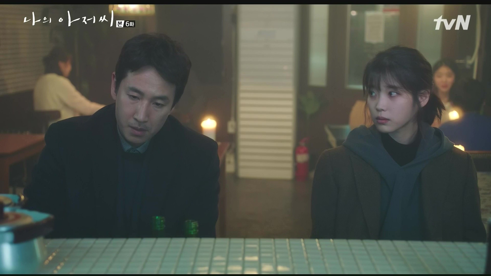
A color palette is something we respond to so organically that sometimes we don’t even realize we’re responding, much like me, scrolling through a My Ajusshi recap, looking at screenshots, and absorbing (through some strange osmosis) the tone of the drama. A few snaps from the show were all I needed to get the feeling of the drama as a whole.
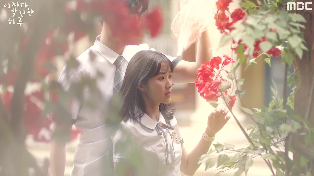
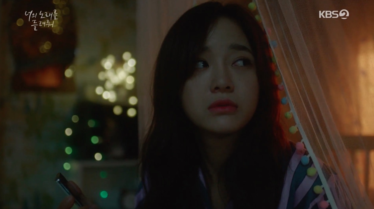
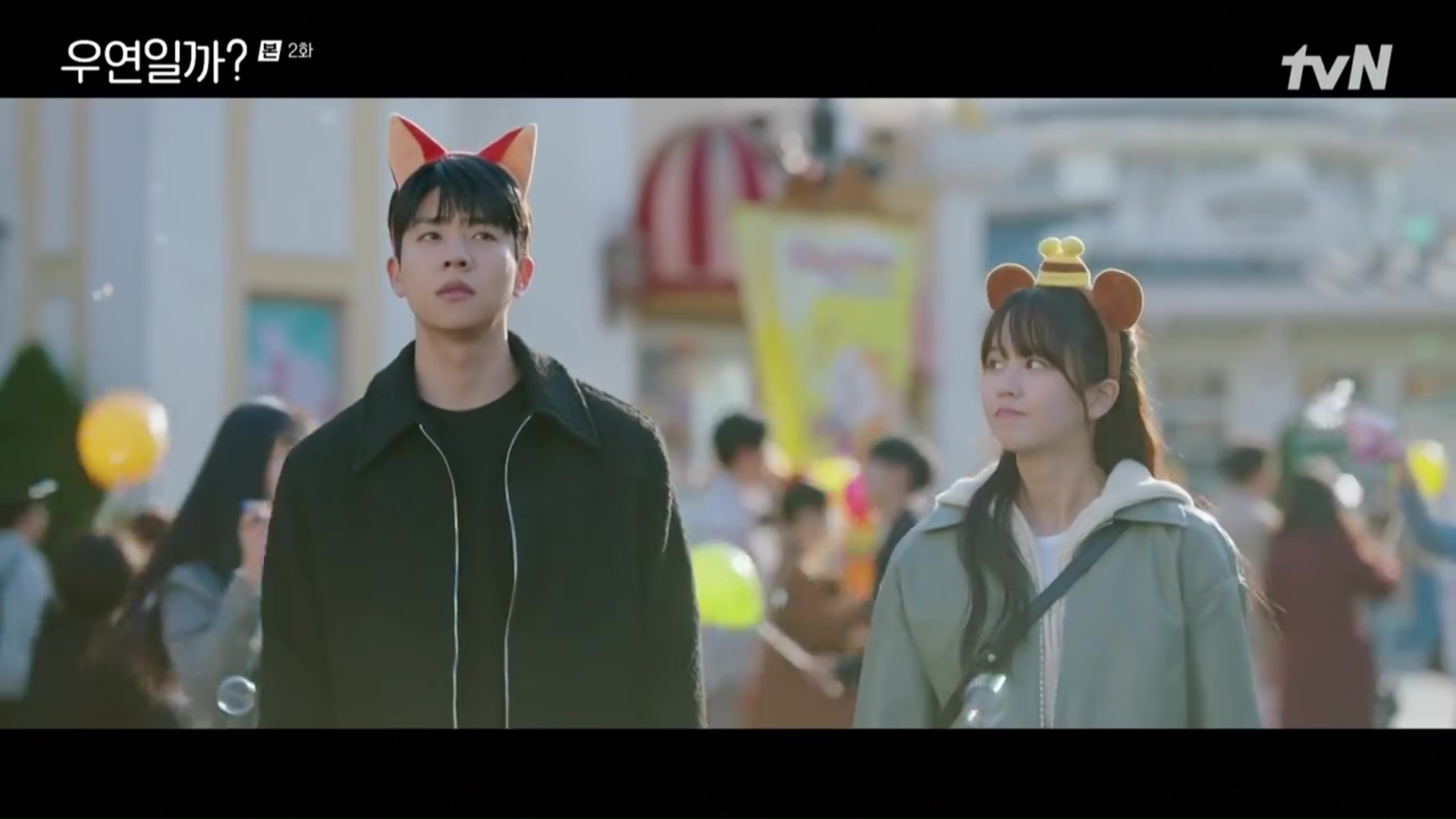
The same thing goes for a drama I’m currently waiting to marathon through — Extraordinary You. I am familiar with the drama’s byline, but have stayed away from peoples’ reactions and thoughts. The only thing I’ve done is peer into the recaps, or even just take a quick look at the leading images — and again, the palette of colors the show uses confirms for me the sort of drama it is. And in this case, it’s pastel-y, warm, and with a high white balance. The palette — the very opposite of the dark and muted color palette of My Ajusshi — tells me that the story of Extraordinary You is charming, magical, youthful, and full of sparkle.
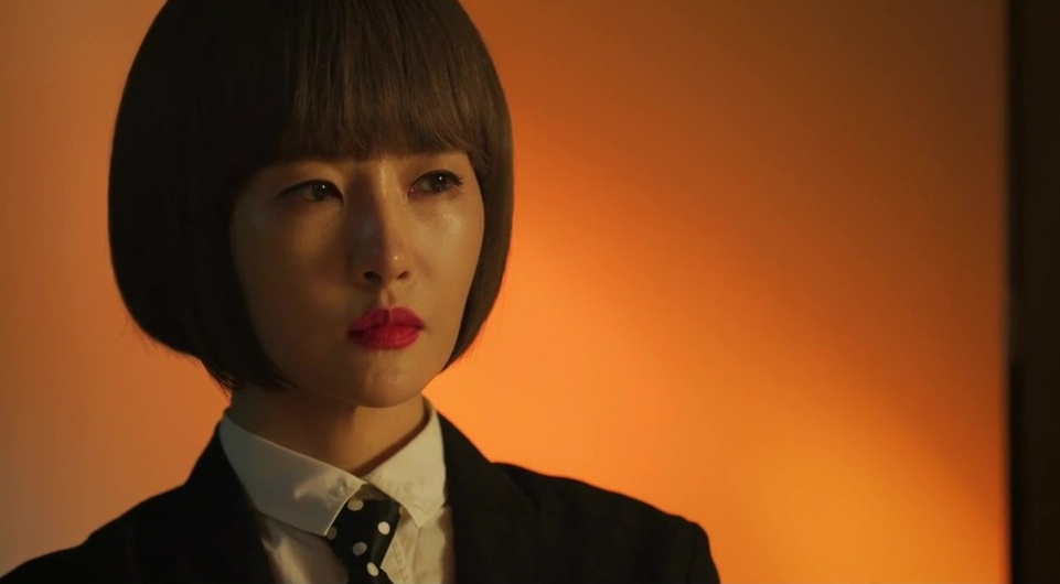
A production like my current drama crush, Secret Boutique, has a palette full of strong and highly saturated colors that adds an intensity to both the characters’ stories and the high stakes revenge scheme of the drama.
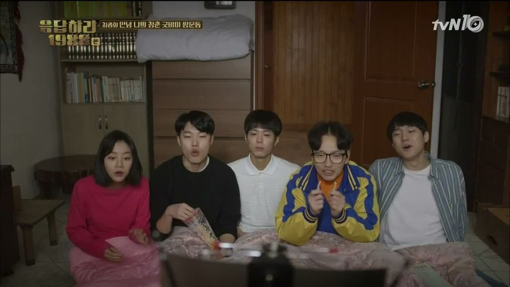
But dramas also drain their color sometimes, or use more “outdated” tones for flashback sequences or to mimic a color palette from the past — think Hyeri’s shabby, precious neighborhood in Answer Me 1988.
Sometimes, color palettes can even become such a strong element that a network’s entire body of productions fits into a tonal schema and almost becomes a part of their brand. A good example of this is OCN productions and their now-unmistakable dark and gritty look.
Things like color palette and tone are a huge part of film as a medium, but all this attention to it sometimes makes me wonder: which comes first, the chicken or the egg? Was the drama’s palette (from the filter on the camera to the wardrobe, makeup, and sets) carefully selected during production to create the aesthetically cohesive dramas we’ve come to expect? Or does that all come together as we are experiencing the drama as it airs and finds its unique flavor on the fly?
Since K-dramas tend to be pretty cohesive creations, I think for the most part the palette is carefully planned. Think of the gorgeous, moody, saturated colors throughout Hotel del Luna, from IU’s outfits and lip color, to the sumptuous sets around her. Such consistent imagery requires quite a bit of work and intentional planning.
Perhaps, then, the trick is to make a drama feel like the highly measured and intentional tone and color palette are effortless, or even accidental. That they’re organic to the drama and just a happy byproduct of the story, when actually they’re studied, curated, and are an integral part of how we experience the drama.
This idea of a color palette impacting a drama’s tone and theme isn’t the only way dramas use color, though. Because dramas are a visual medium, we can’t discount the fact of the simple pleasure they bring to us on a purely aesthetic level.
The fashion and makeup are easy to spot (and enjoy), for most of us. From the latest vivid lipstick to the colorful and inventive clothing characters sport, dramas are a great vehicle for playing with elements that people might not see in their day-to-day — glitter stilettos, parkas with hot pink fur trim, and polka dot headbands with giant pompoms on top. I remember way back when, when I first started watching dramas, how totally enchanted I was with how dramas used things as simple as costumes, hair, and makeup, to make their stories all the more entertaining, and fun for the eyes.
But it doesn’t stop there — aesthetics like color actually drive K-drama sets and scenes as well. Drama sets, and particularly the way homes are staged, are actually something I love to pay special attention to. Primarily, the homes are built to tell us more about the character (their taste, their social position, their emotional climate, etc.) as well as giving a place for the action to take place. But these more functional aspects of the set make it easy to discount the wonderful artistic effort that goes into making these spaces balanced, cohesive, and pleasant to look at — and actually feel like places where people live.
Did a colorful K-drama set ever jump out at you so strongly that you were left: a) marveling over its loveliness b) pausing and Googling to find something similar for purchase (me with Kim Se-jong’s multi-color pompom curtains in Let Me Hear Your Song), or c) wishing you could just disappear into the set? I loved the way Ji Soo’s house (and especially kitchen) in My First First Love looked like a garage sale collection of random, brightly colored, and well-loved items. You have to hand it to a production that’s able to make a space feel so incredibly warm, loved, and lived in.
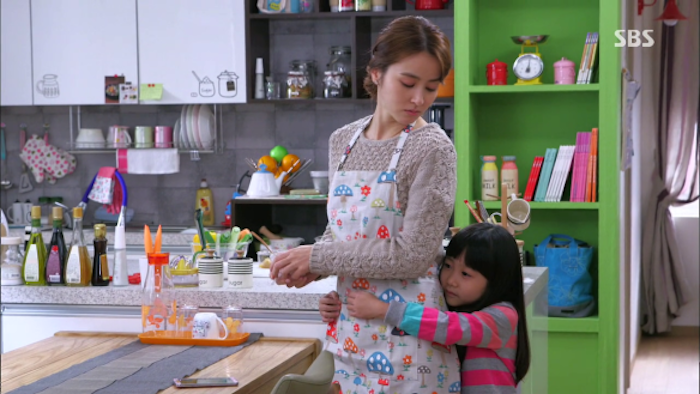
The kitchen that really stole my heart, though, was in a drama that I never even finished — Warm Words. I might have passed on the drama, but the awesome use and balance of color in this kitchen has never left my brain (just look at it!).
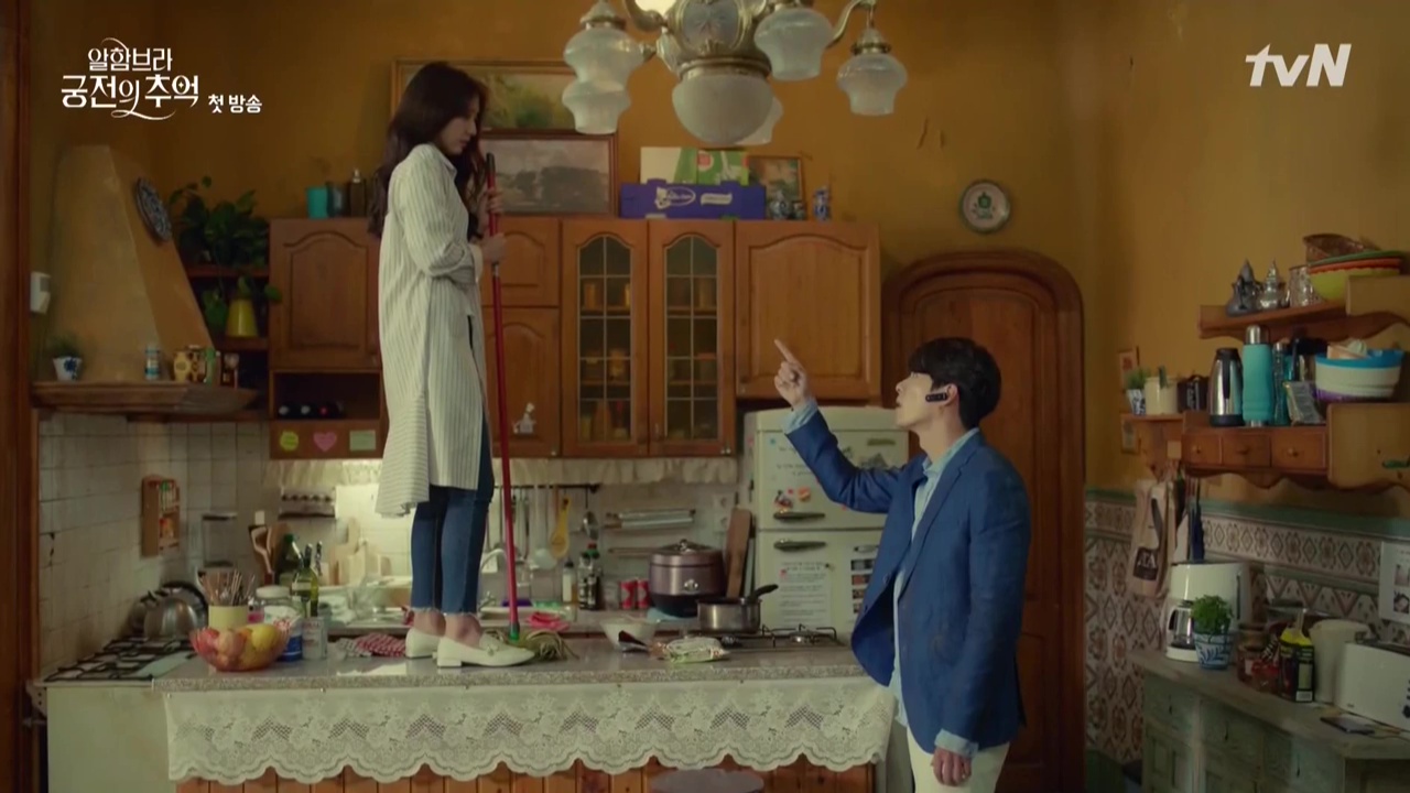
Another favorite kitchen (apparently this is a thing for me), was in Memories of the Alhambra, where the color and design of the kitchen set (even the broom!) created this fairy tale-like setting that was perfect as the drama unfolded its mystery and magic.
There’s no limit to the storytelling power of color, and I’ve only just scratched the surface of how K-dramas sometimes use it. While it’s hard to miss when a color palette creates a strong tone and feel for a drama, color can also inject fun and visual interest into a story as well.
I guarantee if you pay special attention to color in the next episode of the drama you watch, you’ll be surprised at the how much it helps tell the story, how it creates a rich aesthetic — and who knows, vibrant pops of K-drama color just might find their way into your everyday life.
RELATED POSTS
Tags: Answer Me 1988, editorial, Extraordinary You, Hotel del Luna, Memories of the Alhambra, My Ajusshi, My First First Love, Secret Boutique

![[Cast Away] A conwoman is possessed by an upright politician](https://d263ao8qih4miy.cloudfront.net/wp-content/uploads/2023/09/castaway_header1.png)

Required fields are marked *
Your email address will not be published. Required fields are marked *
1 Ms. Rabbit 🐇
November 14, 2019 at 10:31 AM
Thank you for the interesting reading (again), @missvictrix. I was deeply impressed when I saw the interview with Kim Sun Ah and Park Hee Bon for Secret Boutique. They discussed how they chose their outfits (incl. color) depending on their characters and also who their acting partners are in a particular scene. Always appreciate that much attention to details. Btw, the color tone and setting for Chairwoman's evil witch chamber in Secret Boutique always gives me a chuckle. 🤭
Required fields are marked *
missvictrix
November 14, 2019 at 6:22 PM
Comment was deleted
Required fields are marked *
missvictrix
November 14, 2019 at 6:32 PM
Retry:
"Evil witch chamber" hahaha. Where did you see this interview? I'd love if you shared!
Required fields are marked *
Ms. Rabbit 🐇
November 14, 2019 at 6:58 PM
Here you go: (talk about fashion starts ~1:21
https://www.youtube.com/watch?v=7D04D4dPfUU
Required fields are marked *
missvictrix
November 14, 2019 at 7:00 PM
ooh thanks!!
2 Ally
November 14, 2019 at 11:16 AM
I’m a total color palate watcher. Cinematography and the color of a show really makes a show watchable for me. Thanks for writing this! I enjoyed reading it. I enjoyed Tube into Love, the movie that just came out with Kim Go Eun partly because of the cinematic color palate. It was just so dreamlike. Kind of retro too.
Required fields are marked *
Kurama
November 14, 2019 at 12:09 PM
This movie was really beautiful! I loved it. I really liked how the radio show was the continuous thread of the story. It was funny to see the past with the old computer :p
Required fields are marked *
3 Kurama
November 14, 2019 at 12:10 PM
I really like those kind of details in Kdrama.
In EY, it's very well used between the Stage and the Shadow, that is surprisly more warm :p
Required fields are marked *
4 LollyPip
November 14, 2019 at 3:11 PM
I won't spoil it for you, but Extraordinary You actually uses two separate palettes - which one is determined by the circumstances at that moment. I won't say why, but it's a really clever way that the color palette helps tell the story!
Required fields are marked *
missvictrix
November 14, 2019 at 6:20 PM
Gahh I can't wait!
Required fields are marked *
5 JustMe
November 14, 2019 at 3:20 PM
Honestly, props to set designers (Pretty sure they're in charge of palette design). There's so much subtle thought put into it that not many people realize. You can analyze certain scenes for days just by analyzing the set design and the character's costumes!
Also, I can't be the only one that appreciated that Miss V used the word Palette and used to IU dramas as an example. Probably just a coincidence but I do love IU.
Required fields are marked *
javinne
November 14, 2019 at 10:14 PM
Lee Ji eun is the perfect example. Light years between her Ji an from My Ajusshi, and her Ma wol from Hotel de Luna. And at least within the aesthetic point of view, it is because of the color, costume and make up.
Required fields are marked *
6 msheepops
November 14, 2019 at 5:08 PM
Thankyou for the great post! I have always been thinking the same thing about the shooting set (esp. houses). as an archtecture major I LOVE watching dramas with carefully designed houses hihi. Some of my favs were the iconic house in Full House; Chaekyung and Shin’s palace in Goong (along with their teddy bear collections!); and ALL the sets in Chicago Typewriter (I got super obsessed with YooAhIn’s house - its lighting was perfect- I surfed the net to find the drama set location, but it seems it was temporary set, not an actual house)
Required fields are marked *
msheepops
November 14, 2019 at 5:12 PM
Oh and cant left the SKY Castles! Haha. Its a themed residences and not really impressive on their own so kudos to the cameramen and directors for their framing, lighting, etc etc that helped making common things extraordinarily pretty!
Required fields are marked *
7 Beverly
November 14, 2019 at 5:28 PM
Two that come to mind where I remember really noticing the color palette are Cheese in the Trap and Because This is My First Life.
In Tale of Nokdu the colors really pop.
Looking ahead I think, hope, that the drama I'll Go To You When The Weather is Nice will could be perfect for a post like this.
Required fields are marked *
missvictrix
November 14, 2019 at 6:21 PM
Yesss CITT was great for this as well. It's amazing how much it sticks with you.
Required fields are marked *
8 Lookie
November 14, 2019 at 7:35 PM
What an interesting observation. I am new to korean dramas and movies but it was the color and tone of these that really set the mood of the viewer. Color and tone permeate some of the movies that I like so much and hey, come to think of it, even those that I don't! My Ajhussi - grim, dark. It's Ok That's Love - light, dreamy. Burning - heavy, just heavy. But I dropped the highly touted Hotel del Luna, despite its gorgeous and ricb production design. Other things that are so apparent in Korean dramas are metaphors and symbols which are freely but most effectively utilized. Now I favor watching Korean over American movies.
Required fields are marked *
9 WishfulToki
November 14, 2019 at 8:38 PM
Thanks for the interesting read! I'm not familiar with the technical terms, but I have noticed the importance of color and lighting:
1. I tend to prefer dramas with vibrant cinematography and natural, earthy colors. This is often found in sageuks. I almost think I should finish THE CROWNED CLOWN because it was so gorgeous, but the story didn't capture my interest to the end.
2. Washed out colors make me feel tired and drained, but if the story is interesting I'll keep watching. For example, in MISAENG the grey palette was appropriate for an office drama. In contrast, I've dropped most rom-coms this year because, among other things, they looked pale and lifeless, with characters who just strut and fret their hour on the stage.
3. I am not into dark gritty colors, which helps to keep me away from crime thrillers. I did love the retro feel of the palette in LIFE ON MARS but I couldn't stomach the serial killer angle *sob*
P.S.: ARTHDAL had horrible lighting and relentlessly dark colors. The director and crew should read this essay.
Required fields are marked *
amruta1009
November 14, 2019 at 10:02 PM
I feel the same way about dark and gritty. I prefer cheerful, colorful, warm. I hate it when shows have too dark colors that make it hard to see what's going on sometimes. It was a problem when I used to watch some American shows.
Required fields are marked *
gadis
November 14, 2019 at 11:33 PM
The current sageuk spoiled me with its pretty and vibrant colors and costumes that I kept sighing whenever I watch a good old sageuk. I wish I can somehow change the camera used back then because I can imagine how much prettier and more breathtaking the scenes could be.
Required fields are marked *
WishfulToki
November 15, 2019 at 8:50 AM
I recently watched KING'S DAUGHTER SOO BAEK HYANG (2013). It's not that old, but the colors or filters (I don't know the names) were very simple, like using a basic video-recorder. Once I got used to it, I could appreciate the acting. The drama didn't rely on fancy camerawork, and I could even see the pores on their skin.
Required fields are marked *
gadis
November 15, 2019 at 2:26 PM
I'm marathoning Jumong at the moment. And I definitely can feel the 13 years gap very clearly. It's a great story, but whenever I watched it back to back with one of the currently airing drama, I couldn't help but sigh at the old camera work.
Required fields are marked *
bewitched
November 15, 2019 at 8:51 PM
Cannot agree more. Personally the best costume and color tone for sageuk belongs to The King Loves. For older one it’s Jang hyuk’s Chuno. I remember how different the costume and color from the usual sageuk. Jang hyuk’s abs is also memorable tho.
Required fields are marked *
WishfulToki
November 16, 2019 at 2:31 PM
THE KING LOVES was so pretty, with shimmering colours. Combined with the music it really gave it a magical air.
Lol at Jang Hyuk’s abs in CHUNO. There was indeed a lot of shining sweaty skin in that drama!
Required fields are marked *
mugyuljoie is preciousss
November 15, 2019 at 3:38 AM
You should finish The Crowned Clown for the bean, and so you can be puzzled by the horrible last hour like the rest of us.
Required fields are marked *
WishfulToki
November 15, 2019 at 8:44 AM
That isn't such a great incentive LOL
Required fields are marked *
mugyuljoie is preciousss
November 15, 2019 at 1:17 PM
It's intriguing though, plus a bean.
Required fields are marked *
Fly Colours
November 15, 2019 at 5:25 AM
Same here about washed out colours! Although everybody raves about My Ajhussi, I can't get myself to give it a try because it just looks so drab... Inversely, I'm totally willing to watch most sageuks because I'm a fool for the costumes and the overall esthetic...
And I feel like Kdrama has totally spoiled me for european productions (generally speaking, of course there are exceptions) because the cinematography and all the visual aspects are so much superior
Required fields are marked *
Lookie
November 15, 2019 at 5:32 AM
9my Ajhussi is just so dreary... but it is eventually uplifting in the end. Recent dramas like When Camellia Blooms and Tale of Nokdu have distinct colour palettes dictating the changing moods of the drama.
Required fields are marked *
mugyuljoie is preciousss
November 15, 2019 at 1:18 PM
It's so good though, and parts of it become warmer as it goes on.
Required fields are marked *
Fly Colours
November 15, 2019 at 1:22 PM
Might give it a try, then! I was put off by Misaeng's dreariness and ended up enjoying it
Required fields are marked *
Ms. Rabbit 🐇
November 15, 2019 at 1:32 PM
The only thing Arthdal did right was Magic Horse.
#MagicHorseForPresident2020
Required fields are marked *
10 BdxPelik
November 14, 2019 at 9:07 PM
As soon I read the title, I immediately thought of the final scene of Moonlight Drawn by Clouds; the soft, fluffy, warm colour palate they created. Pink, soft purple, light blue. The flowers of the field matched the outfits of the main leads. It's the one image I can't forget from that drama.
Required fields are marked *
Kurama
November 14, 2019 at 9:11 PM
The last scene was beautiful!
Required fields are marked *
11 Fatcat007 (Kitty 💜)
November 14, 2019 at 9:50 PM
Oooh absolutely the palette is a must!
I pay a lot of attention to the drama palette either in promos or ongoing recaps in order to check them out.
I can think of a LOT of dramas where it's so vivid to the eyes how carefully the set, costumes, makeup, ambience, picture quality & angle is planned to match the story & its progression throughout. If done right, it sits very well with viewers & they can simply remember a fav scene of theirs from "where that character was standing/sitting at so & so place and were holding something/ there was a nice eye catchy object nearby..." etc
Required fields are marked *
Fatcat007 (Kitty 💜)
November 14, 2019 at 9:54 PM
Ah also, there's another thing though, many times, the rooms/homes of the characters are over organized/ stocked with things that MAY look ordinary but are actually fancy home decors that a struggling character living in a rooftop def can't afford (just an example.)
Required fields are marked *
12 javinne
November 14, 2019 at 10:06 PM
Oh wow, someone else does the same I do!!!!!!!!
Thank you, @missvictrix, for such sadden interesting article.
And yes, you are right.
When I started watching My Ajusshi it was already on ep 4 or 5 because I scrolled the recaps only to watch the palette and because it was so dark, I didn't want to go there. Nevertheless, I captured a few wonderful comments with little spoilers and the beanie's reactions sold it for me.
A more recent drama I want to mention is miss Lee. True, we don't have the recaps, but from the first episode I paid attention to the palette and it is kind of gray and wash out. The reason may be the plot in itself, I won't spoil it either. But I am now on ep 15 and the palette hasn't changed... you get used to it as well. So far, I won't tell if it's worth watching, but the tone of the drama is totally set through this palette and it's amazing how it works with other elements, in order to bring you a unique story.
Required fields are marked *
13 gadis
November 14, 2019 at 11:30 PM
That'a a very interesting read, @missvictrix. While I unconsciously responded to color palette more than I realized (that would explain my tendency to watch several dramas with similar feels in one cycle), the wonders of sets and costumes didn't really compute in my brain unless it's something very special. Like IU's extravagant clothing in Hotel del Luna. Or my favorite set ever: the Ye brother's apartment in Life. That disabled friendly house instantly teleported me back to my facility layout course back in college.
Required fields are marked *
14 mmmmm
November 15, 2019 at 1:09 AM
Thank you for such an interesting topic to discuss.
I haven't really noticed about a show's color palette until very recently. I used to think that if a show is good, that's enough for me to watch. However, until very recently I just noticed that color palette does make me want to watch a particular show or drop one. Me, personally, I love shows that use soft, pastel and dreamy-like palette like Weightlifting Kim Bok Joo (though I wasn't really into the show like many other beanies did, I think their sweet, dreamy color palette did stand out.), Romance is a New Bonus Book, My First First Love and the on-going show When Camellia Blooms. The palettes used in those shows are just right for me, and I think that was one of the most important factors for me not to drop the shows.
Required fields are marked *
15 Fly Colours
November 15, 2019 at 5:39 AM
This is such an interesting theme! Just got inspired to do a search, and look what I've found! It's not kdrama-related, but I find it really cool: https://www.instagram.com/colorpalette.cinema/?hl=es
Maybe someone should take up the idea and apply it to Kdramas
Required fields are marked *
16 Emyjolie
November 15, 2019 at 10:59 AM
I've noticed colour palettes years ago but it's only recently that it's actually a deciding factor for me: sometimes the colours are so pretty that it makes the set up and drama unwatchable for me.
Here's an example: what's wrong with secretary kim: the actors (especially the female lead) , the decor, the cars, the big house, the secretary's shabby (but not really shabby) rooftop apartment etc... were all so pretty and very pastel-y that it actually ruined the drama. It all felt so unnatural for me amd so unrealistic.
I'm sure that there are some offices out there that are very pretty but in that drama the company looks like a very important, global very serious type that the colours didn't fit that image.
Not sure if I made myself clear enough lol
Required fields are marked *
happiness
November 16, 2019 at 1:14 PM
I've had this problem too with tvN romcoms where I would always find them too flashy(?) for my taste, like when tvN dramas (especially romcoms) used to be announced I could tell how the settings would look like and it would kind of throw me off, but I've learned to accept the flashiness of it
Required fields are marked *
17 R.D.
November 15, 2019 at 1:51 PM
Search WWW. I even saw analysis of Pantone Color in key scenes posted somewhere....
Required fields are marked *
18 ar_arguably romantic
November 15, 2019 at 7:26 PM
It seems like dramas have been killing it with awesome color palettes for the dramas these past 5 years.
Required fields are marked *
19 pinktape
November 15, 2019 at 10:38 PM
I've always been someone who's sensitive to color palette and production design + wardrobe/makeup in general. Since I was a creative writing student, I got to learn about cinematography, mood/tone, mise en scene, color palettes and such, but I never had an opportunity to put all the theories into use (because all I did during uni was... well, writing) until I was involved in a few productions this year.
Production designers spend a lot of time to create every single detail we see on screen, even the ones we (sadly) fail to recognize. Everything that we seen on screen does help us to understand the situation, the whole story, and most importantly, the characters. It's a very hard work; you have to match the director's vision (remember how busy Son Beomsu in Be Melodramatic is before the production of Jinjoo's drama starts) but at the same time have your own understanding/vision too so you can deliver a sincere, detailed outcome. I hope after this we can appreciate this aspect more.
Thank you for the interesting piece!
Required fields are marked *
20 DoubleFault
November 16, 2019 at 5:26 AM
Very informative and interesting post. I find that I too am drawn by the palette, tone & hues and how it all affects the mood of a drama that I'm watching. I believe I initially noticed these with Signal, with how each episodes went from past to present, and then in Circle, when these told the story through two timelines.
Required fields are marked *
21 happiness
November 16, 2019 at 1:15 PM
Time is such an underrated drama but it has a gorgeous gorgeous palette, the cinematography in most of the scenes is breathtaking!
Required fields are marked *